


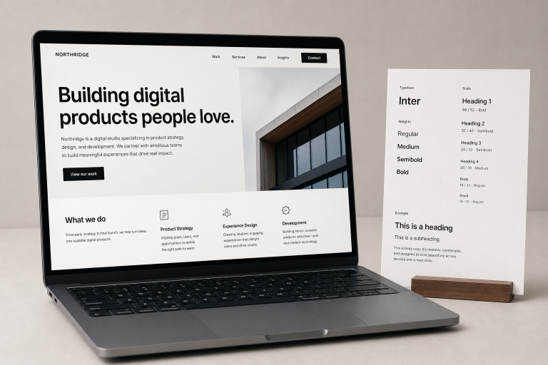
Great web typography does more than make a page look polished. It tells visitors where to begin, what matters most, and how to move through information without effort. Browsing strong typography web design examples can spark ideas, but a dependable website needs more than an impressive headline or fashionable font.
The goal is a system that gives a brand character while protecting readability across pages, devices, and audiences. When type rules are clear, designers can create with confidence, developers can build reusable components, and editors can publish without reinventing the layout every time.
Why Web Typography Needs A System
A font choice is one decision. A typography system is a set of decisions that work together: which text gets attention, how long lines should feel, where spacing changes, and how the page responds at different sizes. On a news page, for example, the lead story, section labels, bylines, and article copy all need distinct jobs. Consistent rules make those jobs recognizable, improving scanning, trust, navigation, and publishing speed.
Start With Reading Goals
Choose the type after defining what visitors need to do. A portfolio may need a memorable first impression. A help center needs calm, efficient reading. A product comparison page needs compact labels that remain clear beside prices and features. Consider whether people will skim, compare, study, or complete a task, then decide which information must be noticed first.
Questions To Ask
- How much text appears on a typical page?
- Will visitors read on small screens, in bright light, or while moving?
- Which actions, headings, or data points need immediate attention?
- Will readers need larger text or stronger contrast?
Choose Font Roles Before Font Names
Define the job before selecting the typeface. Most sites only need a display style for high-impact moments, a heading style for structure, body text for sustained reading, and utility text for labels, captions, and metadata. Buttons and links may use the utility style if they remain easy to identify. One family with several weights often provides enough range. If you pair two families, give each a clear responsibility instead of adding fonts simply to look original.
Build A Clear Visual Hierarchy
Readers should understand a page’s order before reading every word. Size, weight, contrast, placement, and whitespace create that order. Give every heading level a visible difference, keep related items close together, and add enough separation between sections to prevent the page from becoming one dense block. Reserve the strongest color or weight for the most useful message. If five headlines compete at once, none of them leads.
Make Type Responsive
Desktop typography can become crowded quickly on a phone. Use relative units such as rem for base sizes, flexible containers for copy, and sensible maximum line lengths for long-form text. Test long names, translated labels, and unusually long headings rather than relying on short placeholder content.
A Simple Fluid Headline
h1 {
font-size: clamp(2.25rem, 5vw, 5rem);
line-height: 0.98;
}
This approach gives a headline room to grow without allowing it to overwhelm smaller screens. Check navigation labels and calls to action at the smallest supported width, where weak spacing decisions become obvious.
Design For Accessibility
Accessible typography is not about finding one universally “safe” font. It is about creating a reading experience that works when text is resized, contrast changes, or users rely on keyboards and assistive technology. The guidance on text spacing, resizing, contrast, and reflow reinforces that typeface choice is only one part of inclusive design.
- Keep normal text legible against every background, including images and gradients.
- Ensure pages still work when visitors enlarge text.
- Do not communicate meaning through color or weight alone.
- Make links visible without requiring a hover state.
- Check light mode, dark mode, focus states, and reduced-motion preferences.
Use Bold Type With Restraint
Oversized type can make a campaign, editorial page, or launch announcement feel energetic and distinctive. It works best when it has space to lead. Use one strong opening statement, then support it with calmer body copy and clear section headings. Avoid long paragraphs in heavy weights, full sentences in all caps, thin text over busy imagery, and animated words that move before people can finish reading them.
Test With Real Content
Placeholder text hides broken line wraps, awkward headings, crowded labels, and inconsistent spacing. Test short, medium, and long examples in complete layouts on phones, tablets, laptops, and large monitors. Ask someone unfamiliar with the page to find a key detail, then note where they hesitate. A recent shift in digital body-copy recommendations at Ohio State shows how teams can weigh readability, accessibility, brand consistency, and audience expectations together rather than treating typography as decoration.
Create A Practical Checklist
Web Typography Checklist
- Can visitors identify the main message within a few seconds?
- Can they understand the page structure by scanning headings?
- Does body copy remain comfortable on small screens?
- Do headings wrap naturally with real content?
- Are buttons and links easy to recognize?
- Does the page work with larger text settings?
- Are type roles limited, clear, and reusable?
- Has the system been tested with real content and reduced motion enabled?
Conclusion
Effective web typography balances expression with ease. The best systems give a site a recognizable voice while helping people find, read, and use information with less effort. Build deliberate rules, test them under real conditions, and leave enough flexibility for the content and people your website serves.
